
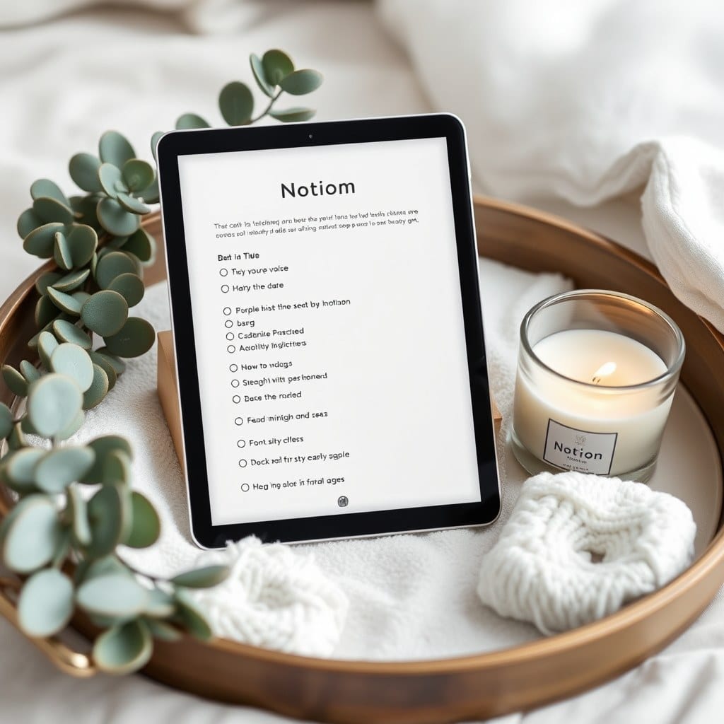
People describe our templates as ‘cozy,’ which is a strange compliment for a piece of software. But it’s the one we design for. A Notion page can feel like a spreadsheet or like a room, and the difference comes down to a handful of decisions you can make deliberately.
We start with the cover image. Not because it’s the most important part, but because it sets the tone before anyone reads a word. A soft photograph of linen, a window, a branch against a wall — something with texture and no text. We avoid gradients and stock photography of people at laptops. The cover should feel like weather, not a brand.
The next decision is spacing. Notion defaults to a fairly tight layout, and most templates fill every inch. We do the opposite. A page with three sections and generous white space reads as an invitation. A page with nine sections reads as a to-do list. When in doubt, we cut a section and let the remaining ones breathe.
Color comes third, and we keep it narrow. One accent, used sparingly. A muted sage for headings, a warm gray for secondary text. If a page uses four colors, the eye has nowhere to rest. We’ve killed more drafts over color than anything else.
Language matters as much as layout. Early versions of our goal-setting template used words like ‘targets’ and ‘milestones.’ They tested fine and felt cold. We rewrote them as ‘what matters this season’ and ‘a small next step.’ Same structure, different temperature. The words are part of the design.
We also design for the screenshot. Most of our customers share their dashboards, and a page that photographs well tends to be a page that’s easy to read. That means strong hierarchy, clear headings, and no dense walls of text. If you can’t tell what a section is for from across the room, it’s too busy.
There’s a temptation to add features because we can. A habit tracker with a heatmap. A reading log with automatic progress bars. We’ve built both and removed both. Features that require upkeep tend to get abandoned, and an abandoned feature is worse than no feature. The page should look finished even when you haven’t touched it in a week.
Testing happens in real weeks, not in demos. One of us will use a draft for a full month — actual mornings, actual deadlines — and note where it snags. The snags are usually small: a field in the wrong order, a heading that’s too long, a view that opens to the wrong filter. Fixing them is most of the work.
We also ask a few customers to try new templates before release. Their feedback is blunt in a useful way. ‘I stopped using the weekly page after two weeks’ is more valuable than any compliment. We’ve rebuilt whole sections based on a single sentence like that.
Finally, we leave room for you. A template is a starting point, and the best ones look a little different in every workspace. If you’ve renamed our sections and moved our pages around, that’s not a failure of the design. It’s the design working.