
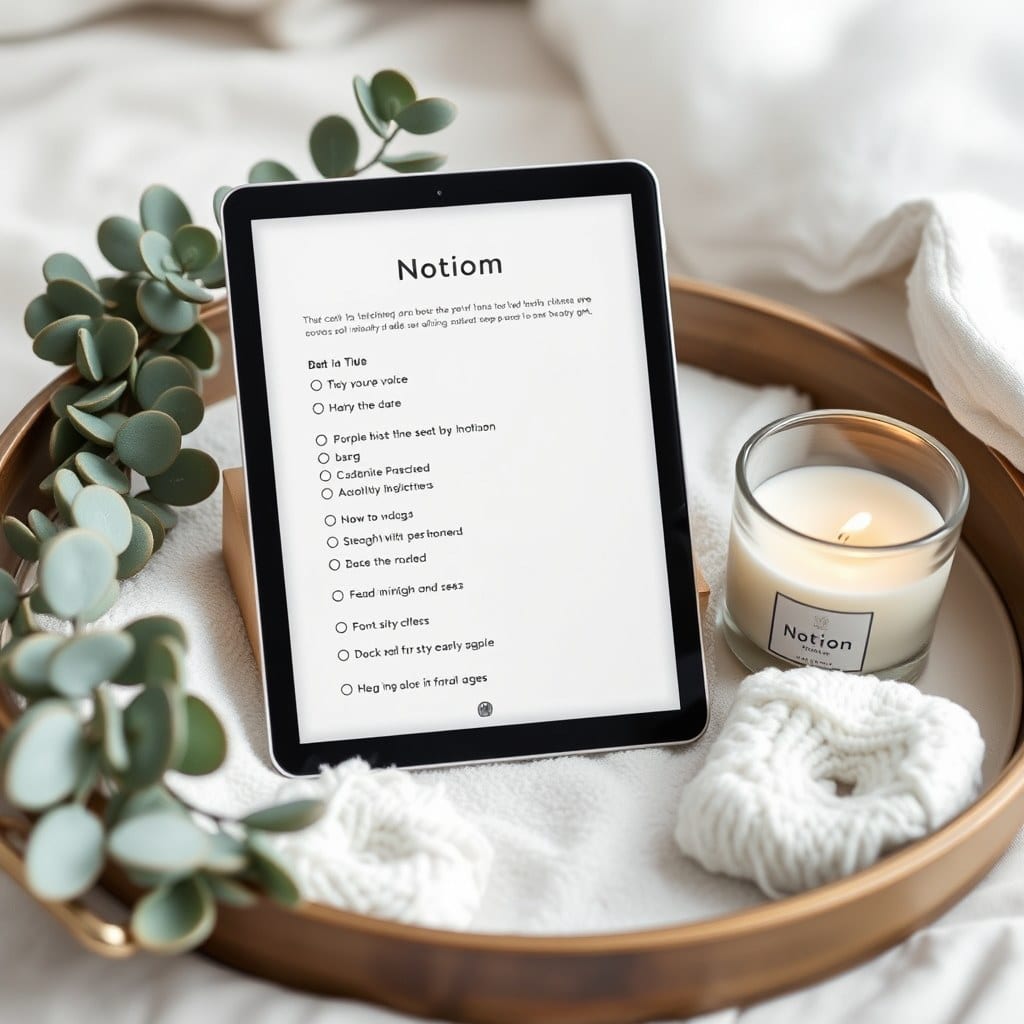
The Quiet Mornings Journal started as a complaint. I’d been journaling in Notion for about a year and had accumulated eleven databases, four linked views, and a homepage that took three seconds to load. It was beautiful in screenshots and exhausting to use. I wanted something I’d open before I was fully awake — which meant it had to be nearly thoughtless.
This is the story of how it went from that mess to the version I actually ship, including the parts I got wrong first.
## The first draft was too clever
My initial build had a mood tracker with a five-point scale, a separate gratitude database, a daily prompt generator, and a weekly review that pulled from all three. It was, frankly, a lot. And the thing about a morning journal is that you’re using it at the worst possible time — half-awake, before coffee, with about ninety seconds of patience.
I gave the draft to five friends for two weeks. The feedback was consistent and a little humbling: they loved how it looked and skipped most of it. The gratitude database got the most entries; the mood tracker got abandoned by day four. People wanted to write, not to fill in fields.
## Cutting it in half
The second version removed the mood tracker entirely and merged gratitude into the daily page as three plain lines. The prompt generator stayed but became optional — a small collapsed toggle rather than a required step. The weekly review got moved to its own page so it wouldn’t loom over the daily view.
The template shrank from nine pages to five. The daily page became the clear center, with everything else support rather than competition. When I sent the second version to the same five friends, the daily entry rate roughly doubled. Not because the new version was more engaging — because it asked less.
## The prompt library problem
Prompts are the hardest part of any journal template to get right. Too generic and they’re wallpaper. Too specific and they only work for certain weeks. My first prompt library had about sixty prompts and I found myself scrolling past them to write whatever I wanted anyway.
The fix was making prompts *optional and seasonal*. Instead of a giant library, the final build has four small sets — one for each season, roughly twelve prompts each — and a note at the top of each set: “Use these or don’t. The page works either way.” That framing did more than any prompt I’ve ever written. People use them more when they’re not confronted with sixty.
## Designing for the screenshot
I’ll be honest about this part, because it’s part of the appeal of this whole category and pretending otherwise would be silly. These templates get shared. People take screenshots of their journal pages and post them, and the ones that get shared tend to have a certain calm to them — generous margins, muted colors, no visual noise.
I designed the final version with that in mind, but carefully. A template that only looks good in a screenshot is a trap — it gets bought, opened, and closed. The test I used was whether the page still felt good to write in at 6 a.m. on a phone with the brightness down. The pastel palette had to stay readable in low light. The margins had to leave room for a real paragraph, not just a line.
## What the beta taught me about defaults
The beta group of around forty people surfaced something I hadn’t planned for: the default entry format. I’d set the daily page to open with a blank freewrite field, followed by three gratitude lines. Most beta users flipped that — they wanted the gratitude lines first, then the freewrite.
It’s a small thing, but it taught me that the order of a page is an argument. Gratitude first says “start here, then expand.” Freewrite first says “just write, the rest is optional.” The final template opens with the freewrite, but the gratitude section is now a single click away and the setup guide explains the tradeoff. Not everyone will agree with my order, and that’s fine — the point is that it’s a choice, not an accident.
## The version you can duplicate today
The shipped Quiet Mornings Journal is five pages, one database, and about a dozen optional prompts. It loads instantly, works on the free plan, and includes a short guide on making it yours. Lifetime updates included, as with everything I build.
I still think about the eleven-database version sometimes. It was more impressive. But the five-page one is the one I’ve opened every morning for the better part of a year, and that seems like the more useful metric.