
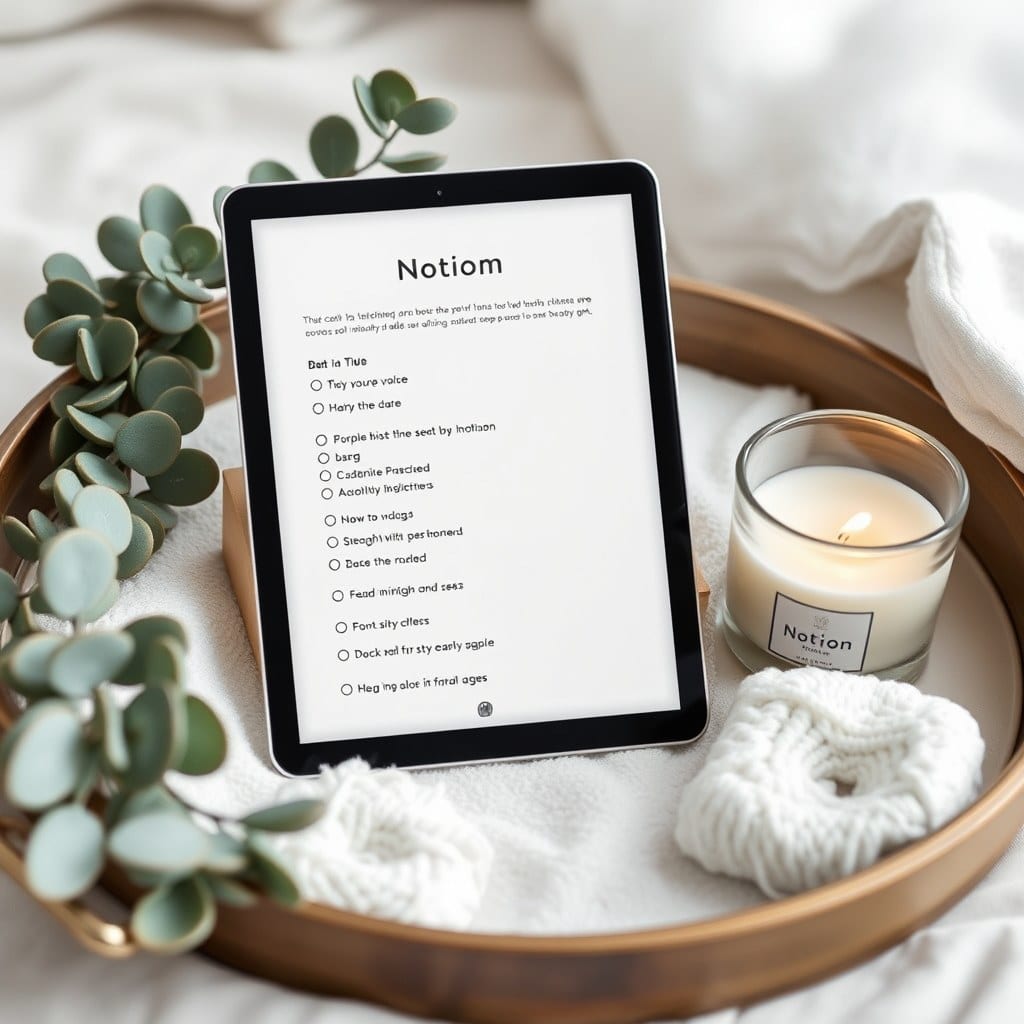
There’s a particular kind of Notion setup that looks impressive in a screenshot and feels like a filing cabinet in practice. You open it, see twelve linked databases and a color-coded dashboard, and quietly close the tab. I know because I built several of them before admitting they weren’t helping.
What changed things for me wasn’t a better system. It was treating my workspace a little more like a room. A room you want to sit in has light, texture, and a few things that are there for no reason other than you like them. A Notion page can have those too, and when it does, you open it more often. That’s the whole trick.
Start with one page — the one you land on. Most people fill it with every project and deadline they can think of. I’d argue the opposite: leave space at the top. A short line of text, maybe a quote or a question, and a single image that isn’t a stock photo of a laptop. Something you’d actually hang on a wall. The page should feel like an entryway, not a lobby.
Resist the urge to build a dashboard that shows everything. A good room doesn’t display all its belongings at once. Put your current journal entry, the one project you’re actually working on this week, and a small list of things you’re looking forward to. Everything else can live one click away, in a place you can name and find. The archive is allowed to be a drawer, not a display case.
Typography does more work than people expect. Notion’s default text is fine; the issue is when every line is the same size and weight. Use a heading for the day or week, a small line of italic text for a note to yourself, and let the body breathe. I keep a single line at the bottom of my daily page in a muted color — something like ‘you don’t have to finish today’ — and I’ve read it more times than any productivity book.
Color is the other lever. Notion’s palette is limited, which is a gift. Pick two or three colors and use them for meaning, not decoration: one for writing, one for plans, one for the things you’re waiting on. The moment you use six colors because they’re pretty, the page stops telling you anything. The constraint is what makes it feel designed rather than assembled.
There’s a practical side to atmosphere too. A page you enjoy opening is a page you’ll update, and a page you update is a page that stays accurate. The prettiest dashboard in the world is useless if it says you’re working on a project you finished in March. Atmosphere and maintenance aren’t opposites; one quietly funds the other.
One exercise I recommend: open your current home page and remove three things. Not reorganize — remove. See what you miss. Usually you miss one of them, and the other two were there because a template told you they should be. Do this every few months. Your life changes and the page should be allowed to change with it.
I think the reason so many people screenshot their Notion setups is that they’re trying to make their inner life feel legible. That’s a good impulse. Just remember the screenshot is for other people and the page is for you. Build the room for the person who actually sits in it — probably at 9 p.m., probably tired, probably looking for one specific note and a little bit of calm.