
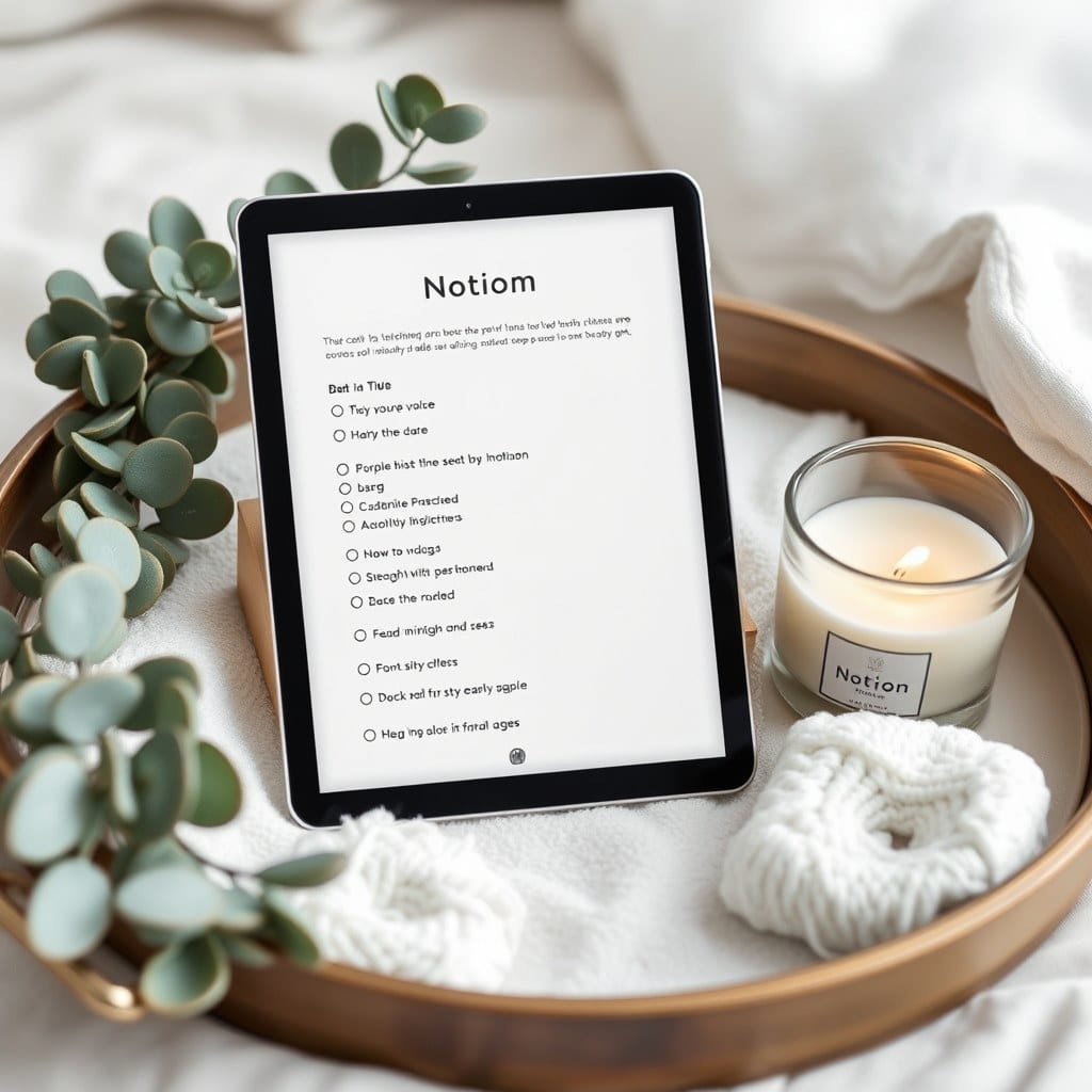
Most people who abandon their Notion setup don’t abandon it because they’re lazy. They abandon it because opening it feels like clocking in. You sit down, there’s a database with forty properties, a dashboard that needs updating, and a nagging sense that you’re behind on something you invented yourself.
I’ve watched this happen to hundreds of people through our templates. The pattern is consistent: the more elaborate the system, the shorter its life. The systems that last are almost embarrassingly simple. A page for the day. A page for the week. One place to put a thought before it disappears.
There’s a design principle hiding in that. If a template is going to survive contact with a real, tired human on a Tuesday night, it has to give something back before it asks for anything. That’s the opposite of how most productivity software is built.
Think about the last app you genuinely enjoyed opening. Not the one with the best features — the one you opened without dread. Chances are it had a short path from opening to doing the thing you came for. Three taps, maybe two. Now think about your current Notion dashboard. How many clicks before you can write down a thought? If the answer is more than one, that’s a design flaw, not a willpower flaw.
This is where the ritual framing matters. A ritual has a beginning, a small set of repeated actions, and an ending. It doesn’t scale. It doesn’t need to. Pouring coffee is a ritual; managing a coffee supply chain is not. When you build a journaling page with a fixed prompt and a place to stop, you’re designing a ritual. When you build a journaling database with tags, mood scores, streak counters, and a linked review dashboard, you’re designing a supply chain.
I’m not against data. I track my own moods and reading. But tracking should be a byproduct of the ritual, not its purpose. The moment you journal in order to fill in a chart, the journaling stops being yours.
Practical version of this: pick one page you open every day and strip it down until it takes under ninety seconds to complete. Remove every property that isn’t a sentence you’d actually write. Move everything else to a weekly or monthly page where it belongs. You’ll lose nothing. You’ll gain a habit.
There’s a second piece, which is aesthetic. I used to think this was superficial — that a well-designed template was just a prettier version of a functional one. I don’t believe that anymore. The visual layer is what makes the ritual feel like a ritual instead of a chore. Typography, spacing, a color palette that doesn’t scream. These aren’t decoration; they’re the difference between a page you tolerate and a page you return to.
Consider two journals on a shelf. One is a spiral notebook with a coffee ring on the cover. The other is clothbound with a ribbon. The contents could be identical. You’ll reach for the second one more often, and you’ll know it. Digital spaces work the same way. A Notion page with generous margins and a serif heading does something to your willingness to sit down that a dense table of checkboxes does not.
This is why we design our templates the way we do — few properties, quiet color, and a lot of white space. Not because minimalism is trendy, but because minimalism is forgiving. A sparse page can handle a bad week. A dense one can’t.
The test I use before shipping anything: would I open this on a Sunday night when I’m tired and slightly sad? If the answer is no, it goes back. That’s the bar. Not ‘does it cover every use case’ but ‘will it still be here in six months.’
If your current setup is failing that test, you don’t need more discipline. You need fewer things on the page. Delete until it’s something you’d look forward to. The rest can wait.