
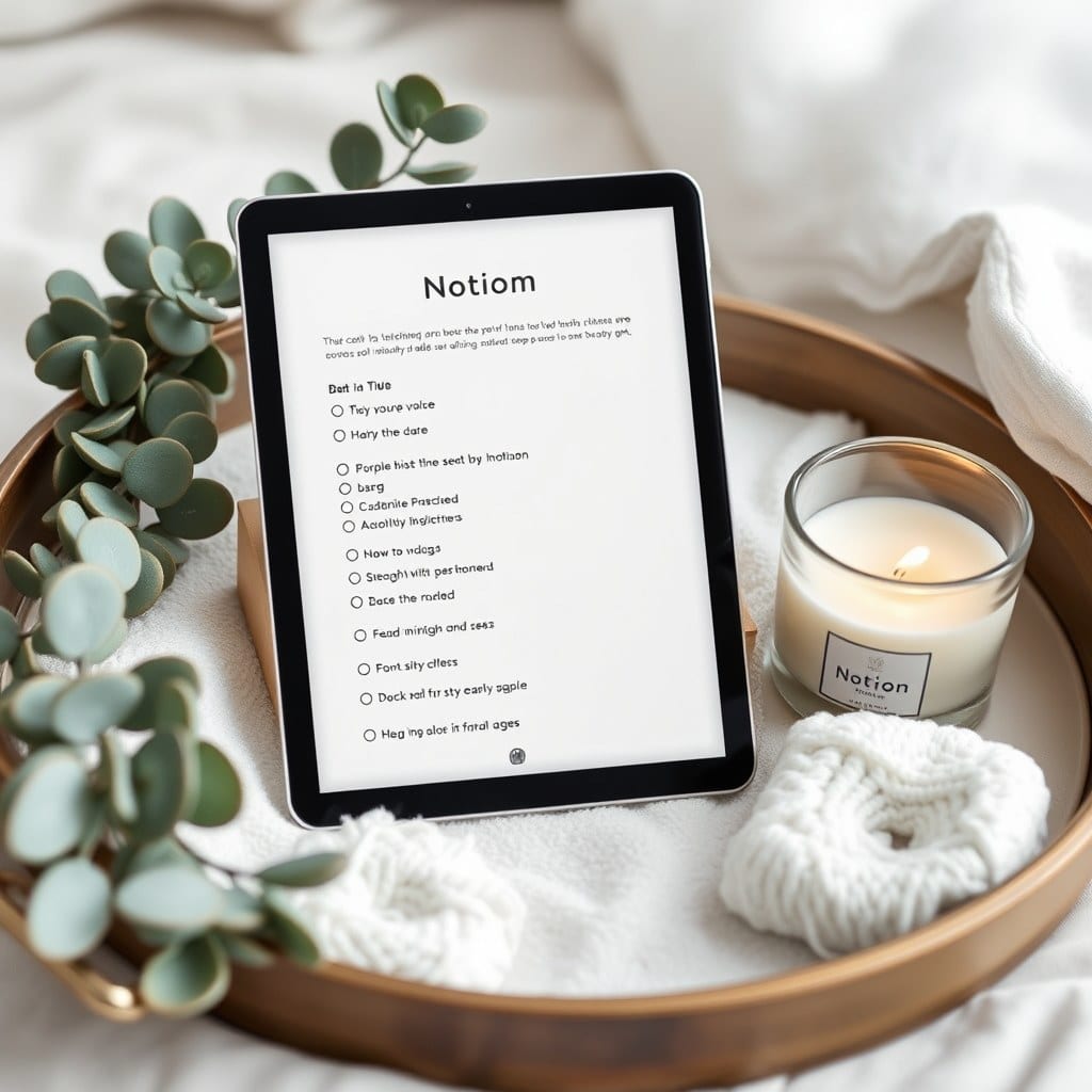
The Life Dashboard has been our most-downloaded template since we launched it two years ago, and for most of that time I’ve had a nagging feeling it was doing too much. Last month we finally rebuilt it from scratch. This is a look at what changed and why, partly because a few people have asked, and partly because the process taught us something about how templates age.
The original dashboard was built around a daily view. You’d open it in the morning, see your three priorities, your calendar, a habit tracker, and a mood check-in. It looked great in screenshots. It was also, in practice, something most people opened twice and then forgot about. When we surveyed buyers, the most common answer to “how often do you use the dashboard” was “I set it up and then stopped.” That’s a bad sign for a template whose entire purpose is to be the first thing you see.
The problem, we eventually figured out, was that the dashboard was competing with Notion itself. Notion already has a sidebar, already has a home page, already has a place where you land when you open the app. Asking people to open Notion and then navigate to a second home page was a step too many. The dashboard was trying to be a destination when it should have been a lens.
So the new version is built around three views of the same data rather than three separate pages. There’s a Today view, which is intentionally sparse — a short list, an open text area, and nothing else. There’s a Week view, which shows what’s coming and what just passed. And there’s a Month view, which is where the goal-setting lives. You move between them with linked views in the sidebar, which means you’re never more than one click from wherever you need to be.
The biggest cut was the habit tracker. I loved the habit tracker. It was a grid of little circles that filled in as you completed things, and it looked wonderful in the template preview. But habits tracked in a grid become a performance. People either filled the grid perfectly and felt good, or missed a day and felt bad, and either way the tracker was doing emotional work that had nothing to do with the habit itself. We replaced it with a simple recurring task list and a weekly note. If you did the thing, you did it. If you didn’t, you didn’t, and the system doesn’t have an opinion.
The second cut was the mood check-in. This one was harder because the data was genuinely interesting over time. But the check-in was daily, which meant it became a chore, and the resulting chart was mostly noise. We replaced it with a single reflection prompt at the end of each week: “How did this week feel?” The answer goes in the Week view, and over a few months you have a record that’s actually readable, because it’s written in sentences rather than plotted as numbers.
What we kept, and expanded, is the goal-setting layer. The original had a yearly goals page that most people filled out in January and never opened again. The new version breaks goals into seasons — three or four months, roughly — and asks you to name only three per season. The constraint is the point. Three goals is enough to feel ambitious and few enough that you can actually remember them without checking. Each goal has a short “why this matters” note, which we’ve found is the single best predictor of whether a goal gets worked on.
The visual design got quieter across the board. The old dashboard used four accent colors, three font sizes, and a lot of iconography. The new one uses one accent color, two font sizes, and no icons except in the sidebar. This wasn’t an aesthetic preference so much as a usability one. When everything is emphasized, nothing is, and a page with four accent colors reads as busy even if you can’t articulate why.
We also rewrote every prompt in the template. The old ones were written in the voice of a productivity coach — “What are your top priorities for the day?” The new ones are closer to how you’d talk to a friend — “What’s the one thing that would make today feel good?” Same function, different feeling. The response to this change has been the most surprising part of the whole process. People write longer answers to the softer prompts, and they come back to them more often.
One thing we didn’t change is the underlying architecture. It’s still the same set of databases, the same relations, the same basic structure. A template’s skeleton should be stable; it’s the surface that needs to evolve as you learn how people actually use it. If we rebuilt the data model every year, existing users would face a migration every time, which is the opposite of a calm system.
For existing owners, the new version is available now as a free duplicate link, and your old version will keep working indefinitely. We’d suggest starting the new one alongside the old for a week rather than migrating everything at once. Move the goals over first, then the tasks, then let the old one sit for a month before you archive it. Transitions are easier when they’re gradual, and there’s no prize for doing it in one sitting.
The whole redesign took about six weeks, most of which was spent deleting things. That’s the part of template design nobody talks about — the work isn’t in adding features, it’s in deciding what to leave out. A dashboard that does five things well will be used. A dashboard that does fifteen things adequately will be abandoned. We learned that the slow way, and the new version is quieter for it.