
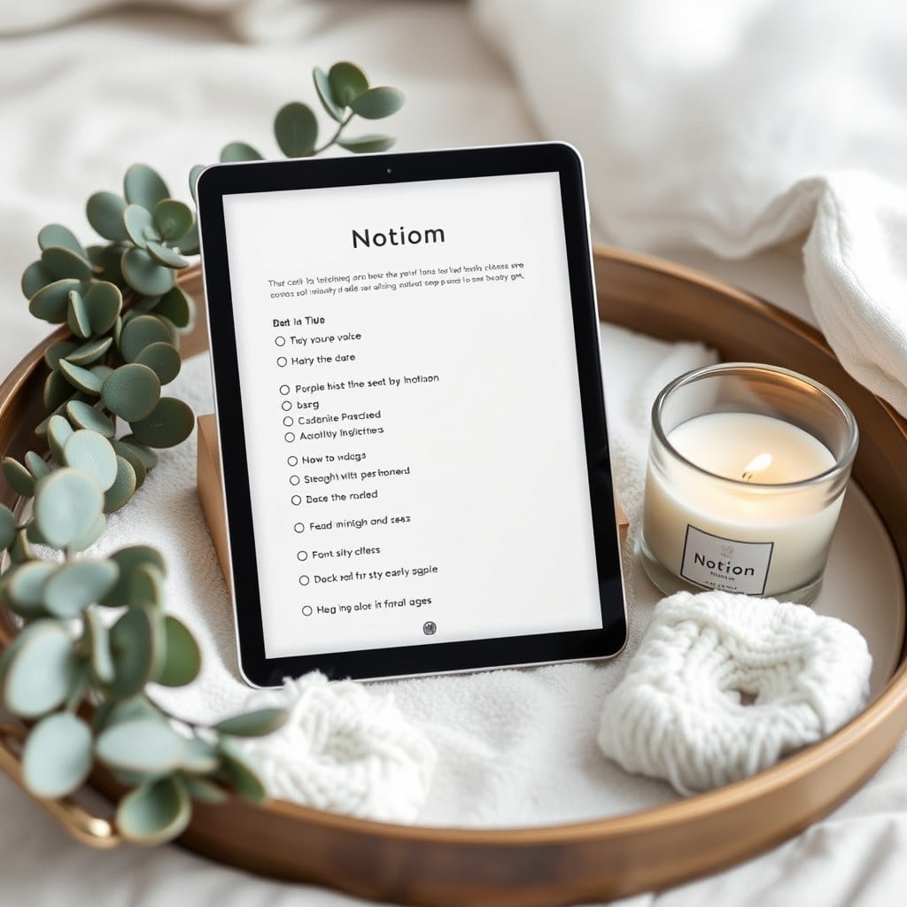
People assume template design starts in Notion. Mine starts on paper, usually on the back of an envelope, usually while I’m supposed to be doing something else. The first version of the Seasonal Journal template was drawn on a receipt from a grocery store in October. It had four boxes and a bad sketch of a moon.
The paper stage is about one question: what does this page need to do for a person on a hard day? Not a good day, when everything feels possible and you’d happily fill in a twelve-field form. A hard day, when you have maybe four minutes and low patience. If the sketch can’t survive that, it won’t survive Notion.
Once a sketch feels right, I build a rough version in Notion — deliberately ugly. Default fonts, no colors, no covers. I use it myself for a week before I touch the design. This is the stage most people skip, and it’s the one that catches the real problems. Last winter I built a goal-setting page that looked beautiful and turned out to be useless, because every time I opened it I had to re-read my own goals to remember what I was doing. The fix was a single line at the top: the one thing this month is about.
A week of real use usually produces a list of small failures. The date property is in the wrong place. The template button duplicates a page I don’t need. The prompts are too long to read at 6am. I keep a running note called ‘friction log’ and I write down every moment I hesitate, even for a second. Hesitation is data.
Then comes the design pass, which is slower than you’d think. I work with a palette of about six colors and I test each one against the others in a real page, not a color picker. Sage next to cream looks calm; sage next to a brighter green looks muddy. I’ve thrown out entire palettes at this stage because one swatch ruined the room.
After the palette, I write the setup page. This is the part I care about most and the part people skip reading. It’s written in plain language, no jargon, and it explains not just where things go but why they’re there. If a buyer can’t understand a page in one read, the page is wrong, not the buyer.
I test everything on my own workspace first, then with three or four people who use Notion differently than I do — one who lives in tables, one who barely uses databases at all, one who works entirely from her phone. The phone test is brutal and necessary. Half of my early templates had pages that looked lovely on a laptop and turned into a wall of text on a phone screen.
Feedback comes back in the form of screenshots, which is my favorite kind. People send me their filled-in versions — their actual goals, their actual journal entries — and I can see exactly where the design helped and where it got in the way. One person circled a prompt and wrote ‘this made me cry, keep it.’ Another asked me to remove a field entirely because it made her feel behind. Both notes went into the next revision.
The last step is the least glamorous. I rebuild the template from scratch in a clean workspace, because a file that’s been edited fifty times carries invisible clutter — orphaned pages, broken relations, leftover test data. The clean rebuild takes an afternoon and saves months of small bugs.
Then it goes out, and the real test begins. Within a week I usually get an email or two. Sometimes it’s a bug. More often it’s someone telling me they used a page in a way I never imagined — one person turned the reading log into a record of letters from her grandmother. That’s the moment a template stops being mine.
I keep a folder of those emails. When I’m deep in the friction log on a new design, wondering whether anyone notices the small stuff, I read a few. They notice. That’s why the process stays slow.