
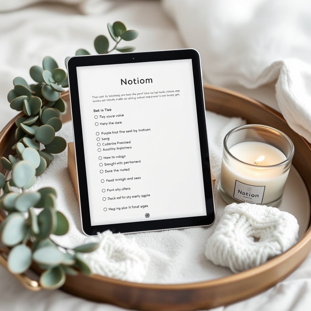
There’s a moment I keep noticing when people share their Notion screenshots. They’ll apologize. “It’s a mess right now,” they’ll say, before showing something perfectly functional — a database with tasks, a calendar, a few pages. It works. But they don’t want to be in it. And I’ve come to believe that’s the actual problem, not the mess.
We’ve been trained to think of a digital workspace the way we think of a factory floor. Inputs in, outputs out. The whole vocabulary is industrial: streamline, optimize, pipeline, workflow. Even the word “system” carries an assumption that the point is throughput. But you’re not a factory. You’re a person, sitting down with a cup of coffee, trying to decide what matters today. Those are different problems and they want different solutions.
I think about this the way I think about a room. A room you want to sit in has light, texture, a place to put your cup. It doesn’t have to be beautiful in a magazine way. It has to be legible and it has to be kind. You know where things are. Nothing is shouting at you. There’s a chair that faces the window.
When I redid my own journaling setup with that idea in mind, the changes were small and mostly aesthetic. I replaced the default gray-on-white with a warm off-white background and a serif heading font. I moved the page icon to something simple. I added a cover image that changes with the season. None of that made me more efficient. All of it made me more likely to open the page.
And that’s the whole trick, honestly. The best system in the world is worthless if you avoid it. The mediocre system you open every morning will outperform it every time.
Here’s a concrete example. A friend of mine — a copywriter — had built an elaborate project tracker with eleven linked databases. It was technically impressive. She used it maybe twice a month. I asked her when she last enjoyed opening it. She laughed and said never. So we deleted seven of the databases and made the remaining four pretty. Two weeks later she was in it daily. Same underlying structure, roughly. Completely different relationship to it.
This is why I’m skeptical of templates that lead with features. “Twenty-two databases!” is not a selling point if the result is a space you dread. What you want is a space with a point of view — one that reflects how you actually think, or at least how you’d like to.
There’s a design principle I keep coming back to: reduce the number of decisions a page asks you to make. Every time you open a page and have to figure out where something goes, you spend a little attention. Do that fifteen times a day and you’ll start avoiding the page. Do it zero times and the page becomes a habit.
Aesthetic choices do more of this work than people give them credit for. Color groups things. Whitespace separates them. A consistent heading style tells you, before you read a word, what kind of thing you’re looking at. Good design isn’t decoration on top of function — it is function, expressed visually.
So if you’re rebuilding your setup this month, here’s what I’d suggest. Start with how you want to feel when you open it. Calm? Focused? Curious? Then work backward. Choose two colors and a font. Pick one image that makes you happy and use it as a cover. Give yourself a page that has no purpose other than being pleasant to look at.
Then use it for a week and notice what you avoid. The thing you avoid is telling you something. Usually it wants to be smaller, or gentler, or moved somewhere you don’t have to see it first thing.
Your Notion is not a machine. It’s a room. Make it one you’d choose to sit in.