
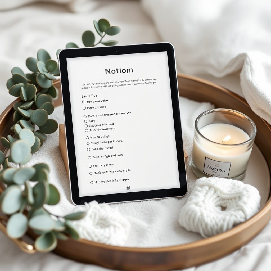
Every template I sell has been rebuilt more times than the version number suggests. The daily journal is on its fourth real redesign, and the honest summary is that each version got shorter. This is the story of how it got here, partly because people ask, and partly because writing it down keeps me from adding things back.
## Version one: the everything page
My first daily journal had a mood selector, an energy slider, three gratitude prompts, a highlight field, a lesson field, a to-do list, a water tracker, and a “tomorrow’s intention” section. It was beautiful in a screenshot. It took nine minutes to fill out, and after eleven days I stopped.
The mistake wasn’t the features individually. It was that I’d designed for the ideal entry — the one where you have time and clarity and something worth saying. Most entries aren’t like that.
## Version two: cutting the metrics
I removed the water tracker first, then the energy slider. Both were data I never looked at again. The mood selector survived longer because it felt meaningful, but I eventually noticed I was choosing the same three moods in rotation and not learning anything from the chart.
What I kept was gratitude and a highlight. Two prompts. That version lasted about four months, which was a record, and taught me that the floor for a journal is lower than I thought.
## Version three: the problem with prompts
Then I made the mistake of adding more prompts, because the template was selling and people asked for variety. I built a prompt rotation — thirty questions that cycled by day. It was clever. It also meant that on any given day, the question might be one I had no answer for, and a blank field is a small accusation.
So I changed the structure. Instead of a rotating prompt, there’s one fixed question at the top of every entry: what’s here today? It’s vague on purpose. You can answer it with a feeling, an event, a complaint, or a single object. Flexibility turned out to matter more than variety.
## Version four: the shape of the page
The current version is two pages, not one. A daily page with the open question, a short list of what happened, and space for a longer thought if one arrives. Then a separate weekly page that holds the review — three questions, seven minutes, done.
The split was the real unlock. Putting the review on the daily page meant every entry carried an obligation to summarize. Separating them let the daily page be loose and the weekly page be structured, which is closer to how memory actually works.
## Small decisions that mattered
A few details that don’t show up in the screenshots:
The text block at the top of the daily page is set to a slightly larger font. Not for aesthetics — it makes the first line feel like an invitation rather than a field.
There’s no date property that auto-fills. You type the date yourself. It takes four seconds and it’s the only part of the ritual that requires you to notice what day it is.
The weekly page has a toggle at the bottom labeled “if it was a hard week.” Inside are three gentler prompts. I added it after a stretch where I skipped four reviews in a row and realized the standard questions were the reason.
## What I stopped worrying about
I used to care a lot about whether the journal “worked” — whether people kept streaks, whether the retention numbers looked good. I still look at those numbers, but less anxiously. A journal that gets used three times a week for a year is a better product than one used daily for a month, even if the second looks better in a chart.
The other thing I stopped doing: designing for the first entry. The first entry is easy. It’s the fortieth that tells you whether the structure holds.
## What’s next
Probably nothing structural for a while. The next update is cosmetic — a lighter cover treatment and a few spacing fixes. I’ve learned that the urge to redesign usually arrives around month eight, and it’s worth sitting with for a few weeks before rebuilding something that’s already working.
If you’re on an earlier version, the update is free and you can duplicate the new one alongside your existing journal to compare before switching. That’s how I test every redesign now — side by side, for a month, before I commit.