
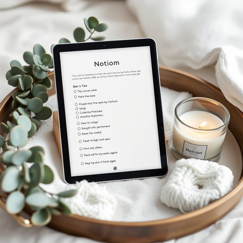
People assume a Notion template starts on a screen. Ours usually start on paper, in a cheap grid notebook, at a kitchen table. The journal template took six weeks and four paper versions before I opened Notion at all.
The first draft was a full-page daily spread: date, mood, three prompts, gratitude, a highlight, a to-do list, and a quote. It looked like a planner ad. On paper it was exhausting. I filled it in for four days and then avoided it, which is the most honest design feedback there is.
The second draft cut it to a date, one prompt, and three lines. That felt too thin — there was nowhere to put the small things that make a day feel like itself. A line about the weather. A sentence about a conversation. The third draft added a short “noticed” section, and that’s the one I kept returning to.
By the time I moved into Notion, the structure was nearly set. What changed was the feel. Notion is a database with a nice font, and it will happily let you build something that looks like a spreadsheet with a poem on top. The work of the last two weeks was mostly subtraction and spacing.
I removed the mood tracker. Mood is real and worth noting, but a dropdown of six emoji faces turns a feeling into data entry. The journal now has a single line called “today felt like” with no options. People write “like a Monday that couldn’t decide” and that’s better than any tag.
I removed the automatic date formula from the daily template, too, at least at first. There’s something about typing the date by hand that slows you into the page. But people asked for it back, and they were right — on a hard morning, the fewer steps between you and a blank page, the more likely you write. The template now pre-fills the date and leaves everything else empty.
The visual design went through three palettes. The first was a warm cream and forest green, which felt like a stationery shop. The second was nearly white and too cold. The final version is a soft paper tone with one accent color the user picks. Color in Notion is loud by default; using one accent consistently is how a page reads as calm instead of busy.
One surprising lesson: the cover image mattered more than I expected. In testing, people opened a journal page with a quiet photograph far more often than the same page with a plain header. It’s not decoration for its own sake — it’s a cue that this is a different kind of place than the task list. We now ship three cover options with every journal template and a note about swapping in your own.
The setup guide was written last and rewritten twice. The first version assumed people knew Notion. The second version talked down to them. The final version is four short steps and a screenshot per step, with a sentence about how to make the journal your own — which prompt to change, which section to delete if it doesn’t fit.
There’s a version of this template with more features: weekly rollups, a mood chart, a linked reading log. I’ve built it. It’s sitting in a folder. It’s good for a certain kind of person, and I might release it as a separate template for people who want it. But the journal that ships is the one I kept opening on ordinary mornings, which is the only test I trust anymore.